August 2021
Text: Alexandra Hörtler; Fotos: intheheadroom
Along with our expanded portfolio, we present our new corporate design. It reflects the newly defined core missions of our brand – staged communication and visual production – and stands for a contemporary, fresh and confident look. Our new image puts the people – our diverse team as well as our diverse clients – at the centre.
The idea: A design that stands out
Our team is a community of experts. Together, we create worlds of stories and emotions. We know who we are and where we are headed. The idea was to create a design that allows the greatest possible creative leeway, that conveys stories, carries the identity of the 30 years of company history and is individually tailored to us, and unmistakable. Focusing on advancing the established brand büro wien, it was important to us to create a visual constant for our wide-ranged service portfolio. How do we see ourselves; how do others see us? How do we want to be seen? Where do we want to go? What makes us stand out? What makes us unique? There were many questions to answer, points of view to change and perspectives to discuss. An exciting challenge that we entrusted the Innsbruck-based design studio in the headroom with.
The appearance: Diverse and with creative leeway
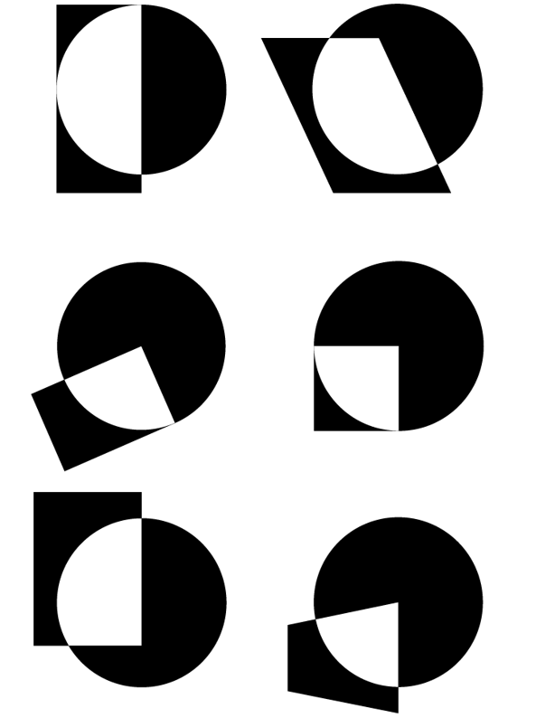
We retained the dot that has been part of the büro wien logo since the agency was first founded. Other shapes were added to it, representing the interdisciplinarity of our staff. The resulting designs feature a variety of intersections that symbolise our different ways of thinking and our unique concepts. In addition to the classic black and white logo, bright colours and fantastic illustrations – unique pieces that were specifically created for us by in the headroom – ound off our new appearance. The shapes open scenes and worlds around our service portfolio. Our website‘s unusual landing page as well as the interdisciplinary storytelling in our concepts magically draw visitors deeper and deeper into the experience. Our message is clear: staged communication is… stories…spaces…interaction…interdisciplinarity…and inspiration!
In conversation with Alexander Kofler and Sophia Hasenauer of the design studio in the headroom:
What was your basic idea for our new visual identity?
büro wien’s activities include a wide variety of disciplines with an array of experts in the fields of design, architecture and communication. büro wien is the interface that brings them all together and helps create something new. It’s almost like walking between worlds. Understanding the clients and connecting the creatives is what sets you apart and allows you to bring to life visual creations in spaces and in communication that are as distinctive and genuine as possible. This in mind, it was clear that we wanted to show what such an interface could look like, from which something new could also emerge. The dot, which was part of your previous logo, remains the centre of the new figurative mark. But we wanted to extend the previous state in order to express the diversity and inventiveness of your team. We added another element to the dot and brought these two shapes into a relationship with each other. This relationship and the overlapping structures create an intersection area suited to express what I described earlier. Different disciplines combine and give rise to something new.
What was your approach?
In the design process, we coded a programme that helped us do the visual arrangements: a simple code that allowed us to generate new intersection areas and shapes with a few clicks and a little shifting of coordinates. This led to the idea that we don’t want to show a figurative mark and a shape, but that the figurative mark may vary visually, and thus it has grown into something kinetic or animated. In retrospect, your corporate design is very exciting to me, not only because we were tasked with designing your appearance, but also because it expresses well how we work in the headroom: First, we make a point of discussing ideas at length and take different angles again and again. Only then we start the design process and at the end, we initiate a dialogue with the design that we developed.
To sum up: The dot as the centre and stage, combined with the rectangle as a symbol of surface or ground plan. This results in an intersection area, inspired by the idea of connection and interplay, which may be visually adapted and modified, while no arrangement will ever be used twice. This design represents the individuality and personality of büro wien.